Odoo 18 introduces a powerful UI framework with OWL, making it easier to create custom field widgets for your models. In this blog, we will create a Boolean field widget named bool_badge, which displays a badge with an icon representing the field's state.
Step 1: Define the JavaScript Component
Create a JavaScript file field_widget.js inside your module's static folder (static/src/js/). This file defines the logic for the custom widget using OWL components.
/**@odoo-module */
import { registry } from "@web/core/registry"
import { standardFieldProps } from "@web/views/fields/standard_field_props";
import { Component } from "@odoo/owl";
export class BoolBadge extends Component{
    updateValue(val){
        this.props.record.update({[this.props.name]: val })
    }
    get value() {
        return this.props.record.data[this.props.name]
    }
}
BoolBadge.template = "BoolBadge"
BoolBadge.props = {
        ...standardFieldProps,
        options: { type:Object, optional: true}
        }
export const boolBadge = {
    component: BoolBadge,
    supportedTypes: ["boolean"],
    extractProps: ({attrs}) =>{
        return {options: attrs.options}
    }
};
registry.category("fields").add("bool_badge", boolBadge)
This component checks the field value and updates it when clicked.
The updateValue() method is triggered when the field's value changes, updating the widget's state and re-rendering it.
After defining the widget class, it must be registered with Odoo's registry. The template property defines the name of the template file used to render the widget. The props property specifies the accepted props for the widget. The supportedTypes property determines the field types the widget can be used with. Finally, the registry.category("fields").add function registers the widget in Odoo.
Step 2: Create the XML Template
The XML file field_widget.xml defines the widget's structure. Place this file in the static/src/xml directory.
<?xml version="1.0" encoding="UTF-8" ?>
<template>
    <t t-name="BoolBadge" owl="1">
        <span class="badge rounded-circle p-2 border"
              t-att-class="value ? 'bg-success text-white' : 'bg-danger text-white'"
              t-on-click="() => this.updateValue(!value)">
            <i t-att-class="value ? 'fa fa-check' : 'fa fa-times'"/>
        </span>
    </t>
</template>
The BoolBadge field will be shown as a small circular badge with different colors and icons based on its value:
Green badge with a checkmark > When the value is True
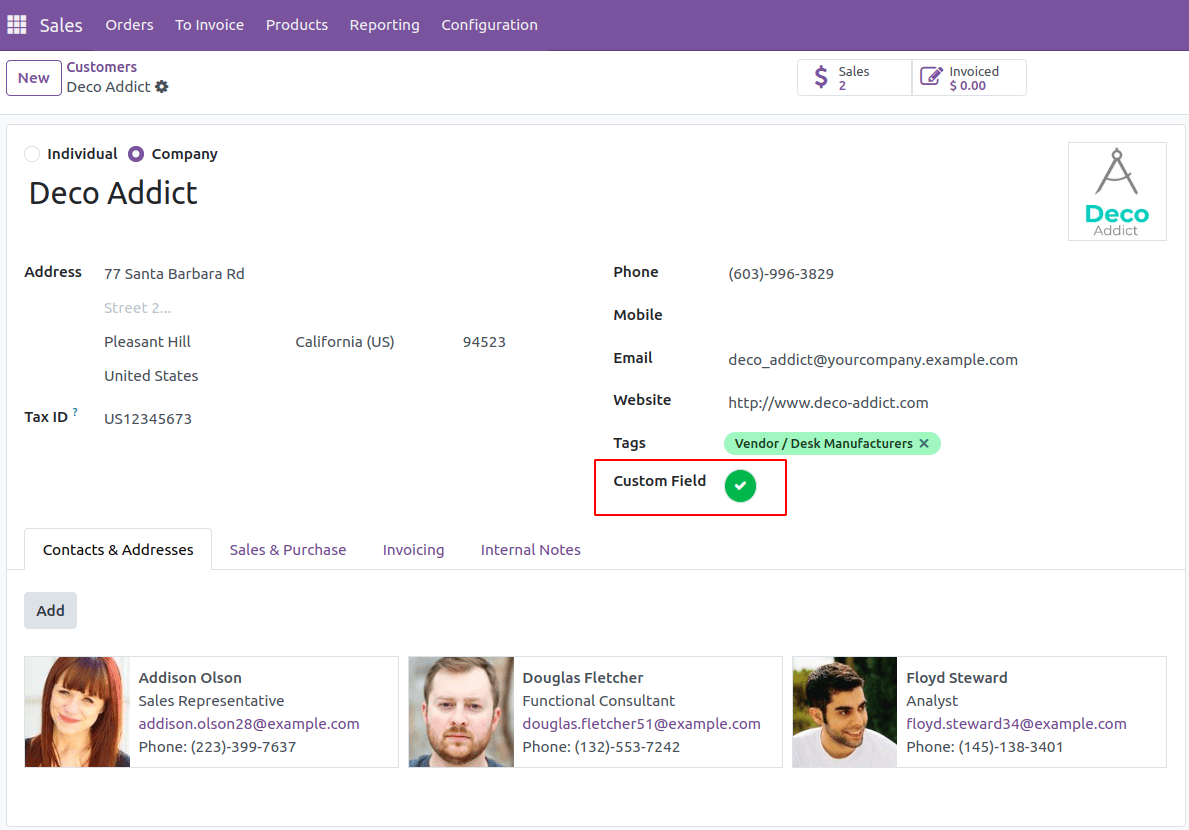
Red badge with a cross > When the value is False
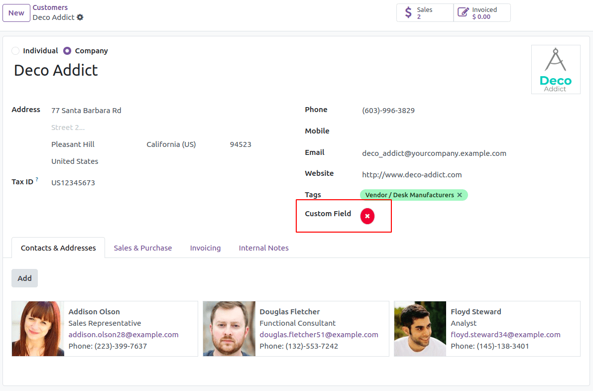
You can click the badge to toggle between True and False. When clicked, the color and icon will change accordingly.
Step 3: Update the Manifest File
Ensure that the widget files are included in __manifest__.py under the web.assets_backend section.
'web.assets_backend': [
    'field_widget/static/src/js/field_widget.js',
    'field_widget/static/src/xml/field_widget.xml',
],
Step 4: Use the Widget in Your Model
Define a Boolean field in your model and apply the widget in the corresponding view.
custom_field = fields.Boolean()
In the XML view file:
<field name="custom_field" widget="bool_badge"/>
By following these steps, you have successfully created a custom Boolean widget in Odoo 18. This bool_badge widget enhances the user experience by providing a visually appealing and interactive UI element. You can further extend this widget by adding custom colors, tooltips, or animations.
To read more about How to Create a Widget in Odoo 18, refer to our blog How to Create a Widget in Odoo 18.