One of the most potent tools accessible to Odoo developers is the ability to customize field widgets. You have total control over how data is shown and interacts on forms and list views, thanks to widgets. Building custom widgets has become clearer, cleaner, and more organized since OWL was introduced in Odoo 16+ and remains in Odoo 19.
In this article, we'll go over how to create a unique Boolean Badge Widget in Odoo 19. This widget lets users toggle a Boolean field with a single click and visually highlights its value. Using a comprehensive working example, we will discuss module structure, Python models, OWL JavaScript components, QWeb templates, asset loading, and view inheritance.
Module Structure
Before writing any code, we structure the module as follows:
blog/
¦
+-- models/
¦   +-- __init__.py
¦   +-- res_partner.py
¦
+-- static/
¦   +-- src/
¦       +-- js/
¦       ¦   +-- bool_badge.js
¦       +-- xml/
¦           +-- bool_badge.xml
¦
+-- views/
¦   +-- __init__.py
¦   +-- res_partner.xml
¦
+-- __manifest__.py
+-- __init__.py
Views, frontend assets, and backend functionality are all kept neatly apart by this structure. Python model extensions can be found in the models directory. All of the frontend JS and XML templates needed for the widget are stored in the static/src folder. The form view inheritance, where the widget will be located, is included in the views folder. Lastly, the manifest file loads assets and declares dependencies to bring everything together.
1. Extending the Model with a Boolean Field
models/res_partner.py
from odoo import models, fields
class ResPartner(models.Model):
    _inherit = 'res.partner'
    is_premium = fields.Boolean(string='Premium Partner')
Here, we add a new boolean field called ‘is_premium’ to the current res.partner model. This field will indicate if a partner is regarded as premium. This step's main goal is to give our custom widget a boolean field that users can see toggle in the form view. The model's default behavior remains unchanged; only a new attribute is added.
2. Creating the Widget Logic (OWL Component)
static/src/js/bool_badge.js
/** @odoo-module **/
import { registry } from "@web/core/registry";
import { standardFieldProps } from "@web/views/fields/standard_field_props";
import { Component } from "@odoo/owl";
export class BoolBadge extends Component {
    static template = "custom_bool_widget.BoolBadge";
    static props = {
        ...standardFieldProps,
    };
    updateValue(val) {
        this.props.record.update({ [this.props.name]: val });
    }
    get value() {
        return this.props.record.data[this.props.name];
    }
}
export const boolBadge = {
    component: BoolBadge,
    supportedTypes: ["boolean"],
};
registry.category("fields").add("bool_badge", boolBadge);
The fundamental functionality of our widget is defined by this JavaScript file. BoolBadge is a newly created OWL component that links to the template custom_bool_widget.BoolBadge. The value, field name, and record object are among the typical field props that are automatically sent to the widget. The current boolean state is returned by the value getter, and when the user interacts with the widget, updateValue() modifies it in the model. Lastly, the component is registered under the name bool_badge in Odoo's field widget registry, allowing us to utilize widget="bool_badge" on any boolean field in the future. The complete script regulates the field's front-end behavior.
3. Building the Widget Template (QWeb + OWL)
static/src/xml/bool_badge.xml
<?xml version="1.0" encoding="UTF-8" ?>
<templates xml:space="preserve">
    <t t-name="custom_bool_widget.BoolBadge" owl="1">
        <span class="badge rounded-circle p-2 border"
              t-att-class="value ? 'bg-success text-white' : 'bg-danger text-white'"
              t-on-click="() => this.updateValue(!value)">
            <i t-att-class="value ? 'fa fa-check' : 'fa fa-times'"/>
        </span>
    </t>
</templates>
This template specifies how the widget will look. A little circular badge that represents the Boolean value—green for true and red for false—makes up the user interface. Depending on the value, either a cross or a checkmark appears inside the emblem. The updateValue() method is called when the badge is clicked, instantaneously changing the value. This dynamic styling and interactive elements show how OWL makes creating widgets simple and adaptable.
4. Adding the Widget to the Partner Form View
views/res_partner.xml
<?xml version="1.0" encoding="utf-8"?>
<odoo>
    <data>
        <record id="view_partner_form_custom_widget" model="ir.ui.view">
            <field name="name">res.partner.form.custom.widget</field>
            <field name="model">res.partner</field>
            <field name="inherit_id" ref="base.view_partner_form"/>
            <field name="arch" type="xml">
                <xpath expr="//field[@name='category_id']" position="after">
                    <field name="is_premium" widget="bool_badge" string="Premium Status"/>
                </xpath>
            </field>
        </record>
    </data>
</odoo>
We alter the partner form in this XML file by taking over the original view and adding our own field right after the category field. Widget="bool_badge" is crucial since it instructs Odoo to use the previously registered widget to represent the field. The boolean value will show up as an interactive badge rather than a conventional checkbox as soon as this view loads. This illustrates how Odoo's current form framework easily incorporates custom widgets.
5. Manifest
manifest.py
{
'name': 'Custom Boolean Badge Widget',
'version': '19.0.1.0.0',
'category': 'Tools',
'summary': 'Adds a custom Boolean badge widget to Partners',
'depends': ['base', 'contacts'],
'data': [
'views/res_partner.xml',
],
'assets': {
'web.assets_backend': [
'blog/static/src/js/bool_badge.js',
'blog/static/src/xml/bool_badge.xml',
],
},
'installable': True,
'application': False,
'license': 'LGPL-3',
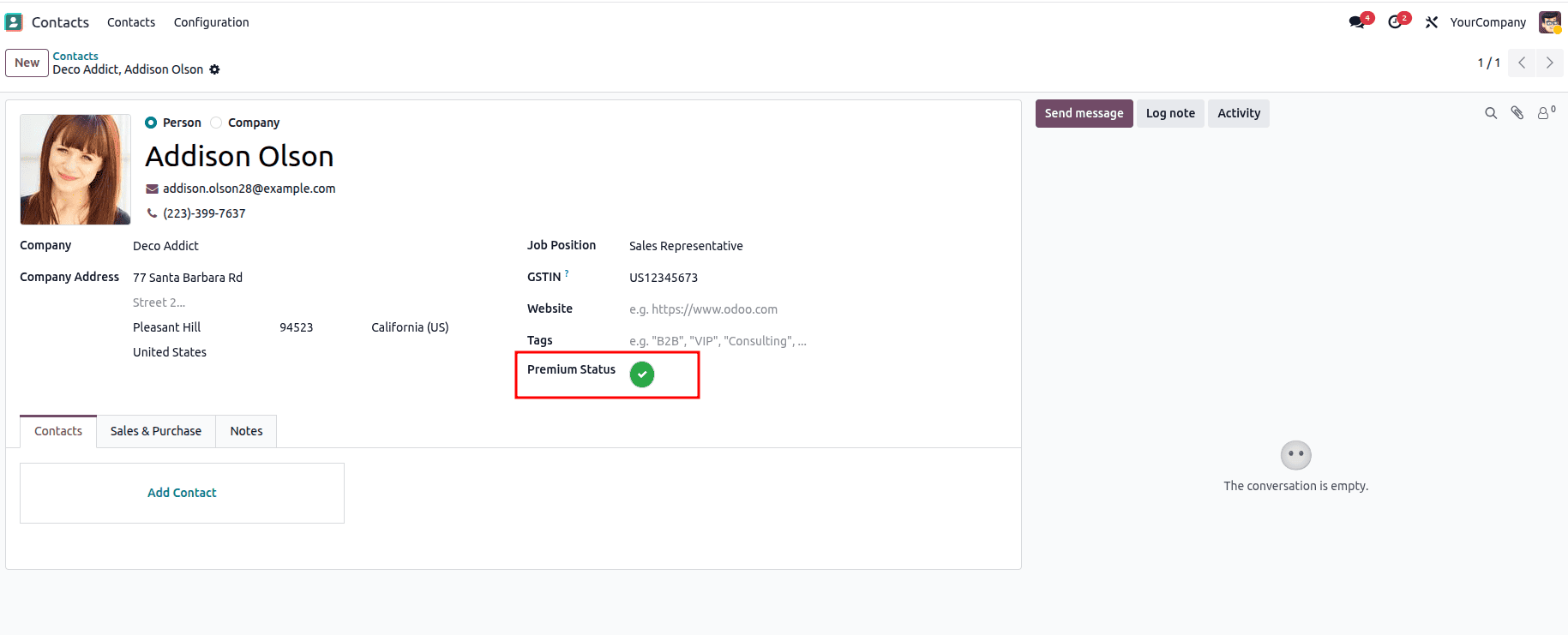
}The module is connected by the manifest file. Metadata like the module name, version, and necessary dependencies are declared. While the assets part makes sure that Odoo includes the JavaScript and XML files inside the backend asset bundle, the data section imports the form view updates. As a result, the widget is accessible across the backend user interface. Odoo detects the widget and renders it automatically wherever we use widget="bool_badge" after these files are loaded. The outcome is as follows:

Conclusion
In Odoo 19, creating a custom field widget is a simple and satisfying procedure. You may customize the user experience to fit any business requirement by integrating Python models, OWL components, QWeb templates, and view inheritance. In this example, we created an elegant and interactive Boolean Badge Widget that improves the partner form by substituting a contemporary, clickable badge for a conventional checkbox.
Many more sophisticated widgets, such as badge counters, toggle switches, progress bars, file previews, and more, can be created using this method. Because of Odoo's versatility, you may create strong UI changes that greatly increase usability with just a few files and organized development.
To read more about How to Create a Field Widget in Odoo 18, refer to our blog How to Create a Field Widget in Odoo 18.