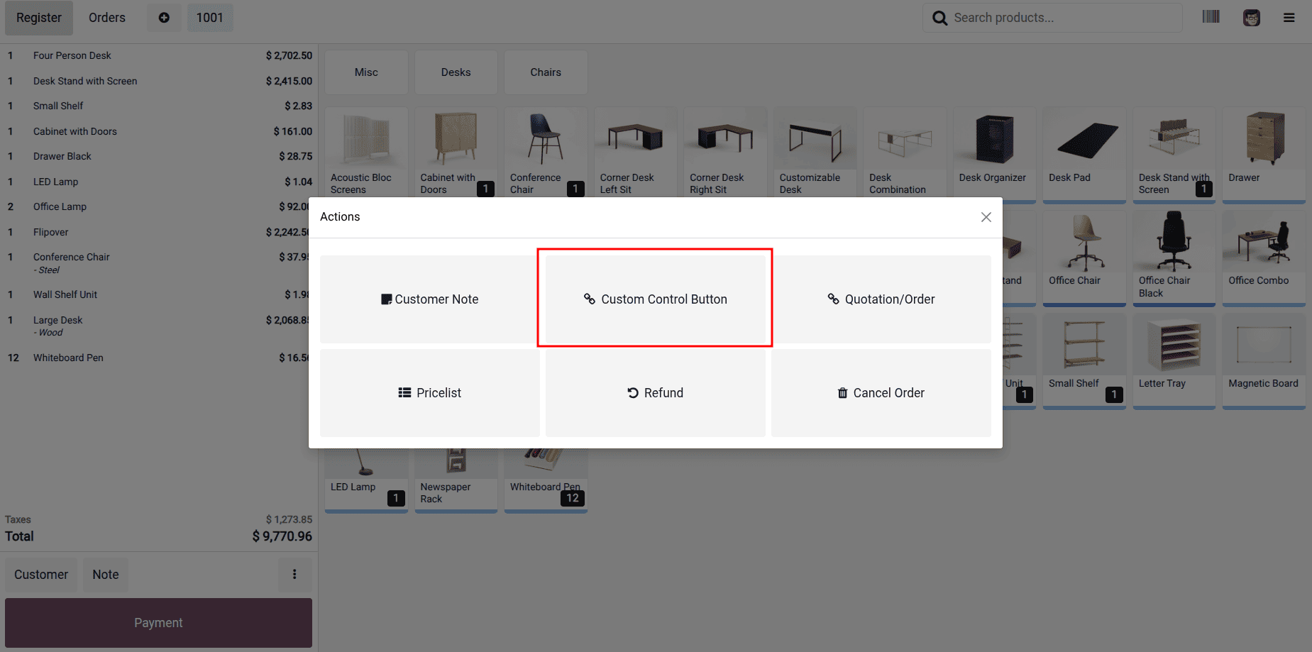
Odoo’s Point of Sale (POS) module features a flexible and highly interactive interface that can be tailored to suit a wide variety of business workflows. One of the most impactful areas to enhance is the POS product screen, where adding custom buttons can help trigger specialized actions—whether that’s launching a popup, applying discounts, or integrating external services.
In this blog post, we’ll walk through a clear and practical example of how to introduce a custom control button within the POS product screen. When selected, this button will display a simple confirmation popup containing a message of your choice. This serves as a straightforward starting point that you can expand into more complex functionality as needed.
Step 1: Extending the POS ControlButtons Component
Odoo’s frontend is powered by the Owl framework, and many of the POS interface elements—including the product screen—are built as Owl components. The ControlButtons component specifically handles the display of action buttons within the product screen. To introduce new functionality in this section, we can “patch” the component using Odoo’s built-in patch utility.
In our custom module, we begin by creating a new JavaScript file, such as custom_button.js. Inside this file, we import the required resources, including _t for translations, ConfirmationDialog for rendering popups, and the ControlButtons component. Using the patch function, we then extend the component by defining a new method named onClickMessage, which will be triggered when our custom button is pressed.
Here’s how the code looks:
/** @odoo-module */
import { _t } from "@web/core/l10n/translation";
import { ConfirmationDialog } from "@web/core/confirmation_dialog/confirmation_dialog";
import { patch } from "@web/core/utils/patch";
import { ControlButtons } from "@point_of_sale/app/screens/product_screen/control_buttons/control_buttons";
patch(ControlButtons.prototype, {
   onClickMessage() {
       this.dialog.add(ConfirmationDialog, {
           body: _t("Your custom Message is here"),
           confirmLabel: _t("Confirm"),
       });
   },
});
This patch adds a new method, onClickMessage, which is executed whenever the custom button is pressed. Within this method, we trigger a confirmation popup using Odoo’s built-in ConfirmationDialog component. Additionally, the _t() function is used to ensure that the displayed message supports translations, keeping the feature fully compatible with multi-language environments.
Step 2: Inserting the Button into the POS UI
With the button logic in place, the next step is to visually integrate it into the POS interface. To accomplish this, we rely on Odoo’s QWeb templating system.
We begin by creating a new XML file—such as custom_button.xml—inside the static/src/xml directory. In this file, we extend the existing point_of_sale.ControlButtons template using t-inherit with t-inherit-mode="extension". We then identify the section where the current buttons (for example, the NoteButton) are defined and insert our custom button directly after it, ensuring a seamless addition to the existing UI layout.
Here's the XML code:
<?xml version="1.0" encoding="UTF-8"?>
<templates id="template" xml:space="preserve">
   <t t-name="pos_sale.ControlButtons"
      t-inherit="point_of_sale.ControlButtons" t-inherit-mode="extension">
       <xpath expr="//t[@t-if='props.showRemainingButtons']/div/NoteButton"
              position="after">
           <button t-att-class="buttonClass"
                   t-on-click="() => this.onClickMessage()">
               <i class="fa fa-link me-1" role="img"
                  aria-label="Set Custom Message" title="Set Custom Message"/>
               Custom Control Button
           </button>
       </xpath>
   </t>
</templates>
In this template, we introduce a new <button> element and bind its click event to the onClickMessage method created earlier. To make the button visually recognizable, we apply FontAwesome’s fa-link icon and assign a clear, descriptive label that aligns with the intended action.
Step 3: Declaring Assets in the Manifest
With both the JavaScript logic and the XML template prepared, the final step is to ensure Odoo loads them correctly as part of the POS asset bundle. This is handled by updating the module’s __manifest__.py file.
Inside the assets section, we register our newly created JS and XML files under the 'point_of_sale._assets_pos' key. This ensures that the POS interface incorporates our custom functionality and renders the button as intended.
'assets': {
   'point_of_sale._assets_pos':
[
       'pos_sale/static/src/js/custom_button.js',
       'pos_sale/static/src/xml/custom_button.xml',
   ],
},
Once everything is configured, start your POS session and open the product screen. You should now see a new button labeled “Custom Control Button” alongside the existing controls—such as the discount and note buttons—indicating that your customization has been successfully integrated.
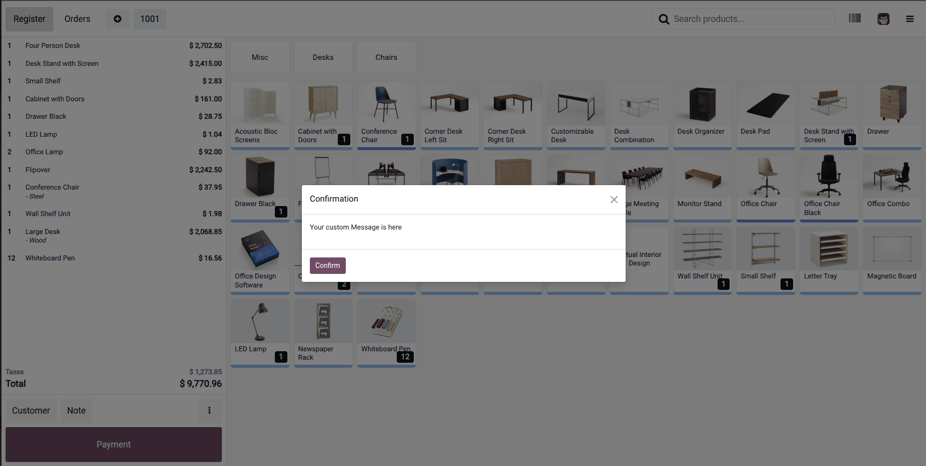
Clicking the button will open a clean, user-friendly popup displaying your custom message.
This approach not only demonstrates how to display a simple popup, but also lays the groundwork for building more advanced interactions—such as executing RPC calls, applying tailored business rules, or collecting user input through custom-designed dialogs.
Customizing Odoo’s POS interface is both powerful and approachable once you become familiar with the Owl component framework and QWeb templating structure. In this tutorial, we created a basic custom button that triggers a confirmation dialog, providing a flexible starting point that you can further expand to meet any business-specific needs.
To read more about How to Create/Modify Component Control Buttons in POS Odoo 18, refer to our blog, How to Create/Modify Component Control Buttons in POS Odoo 18.